Soundtrap
School - Berghs School of Communication
My Role - Team member 1/3, UX/UI
Project Timeline - 2 weeks
Constraints - Short time span, no budget, limited access to company data.
Brief - A great part of any creative work is the initial step of collecting and sharing inspiration and ideas. As designers, we often use tools such as Pinterest to collect visual ideas. Think of something similar but for collecting sound clips and music. The user should be allowed to add content to this board from a whole range of different sources. Think of all possible scenarios where a user would want to save a sound.
About Soundtrap - Soundtrap is a online music creation tool and music community where collaborators from the whole world can come together get inspired and create music together. Soundtrap is a part of Spotify AB.
Research - Our team had only 2-week to complete the project, which made it important that we strategize in an early stage. How could we get the most relevant information we needed without access to a large number of users? We also asked ourselves in this initial stage what part of the interface today created the most pains and gains, and really tried to set out a path to find out what the users wanted and what they prioritized.
We decided as a team to use the existing users that we could reach through the company as well as users through our own network, that have used or uses the platform today for interviews and testing.
Benchmarking - We looked at other online music services, as well as sharing and cloud services. Further looking at their structure, what they filtering on, and their basic functions. We did a heuristic analysis of the existing site and after that, we did a design studio as a group. Based on the heuristic analysis and with our brief in mind, we took to sketching based on the current profile page with regards to the data we’d found when it came to functions, etc.
User surveys - We organized a workshop where we individually brainstormed ideas for questions that we wanted to ask the users. We sent out a questionnaire with about twelve different questions, both multiple options, but also questions demanding more elaborate answers. We collected this information, which was quite broad, and took to sketching and created a provisional hypothesis.
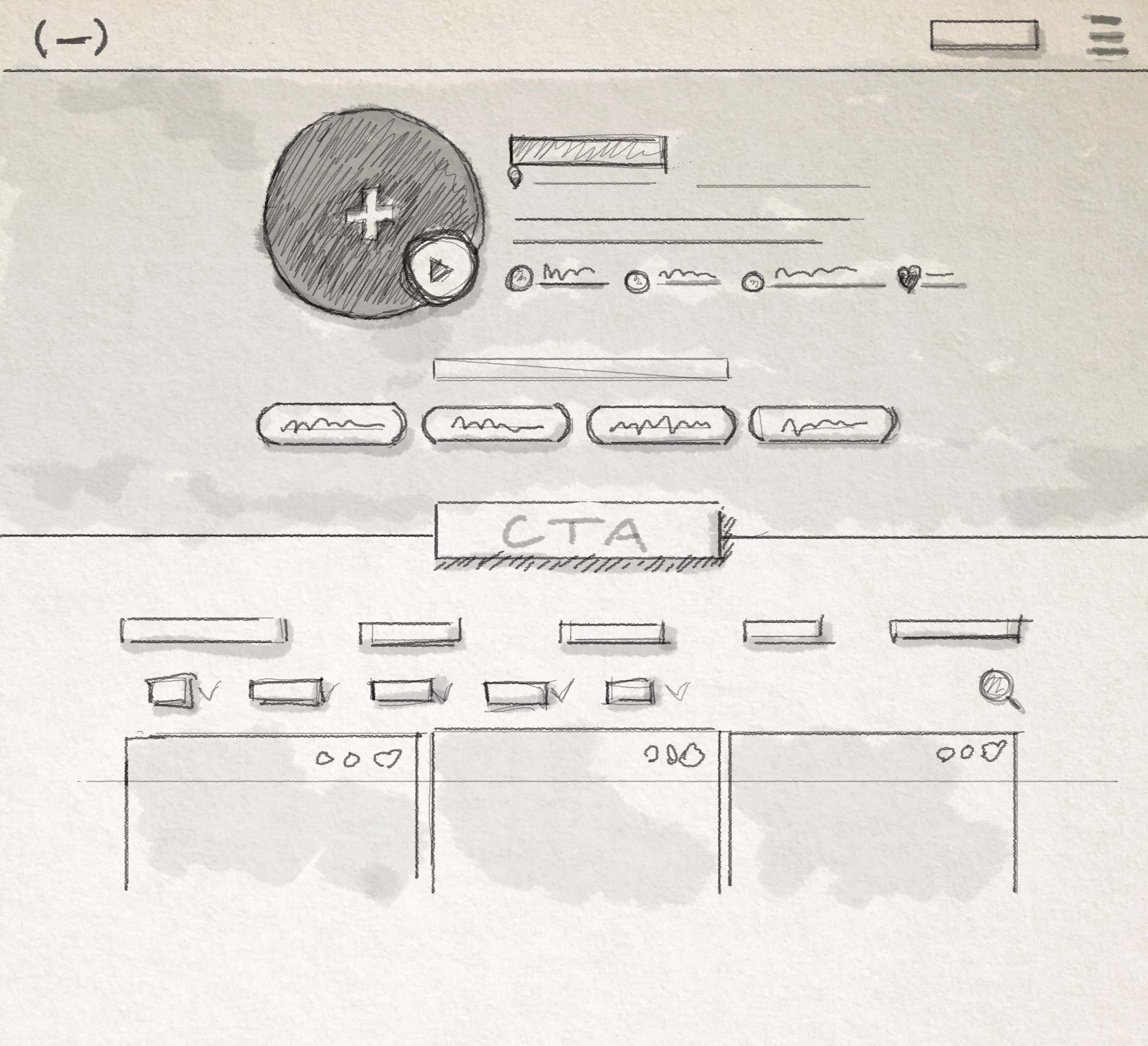
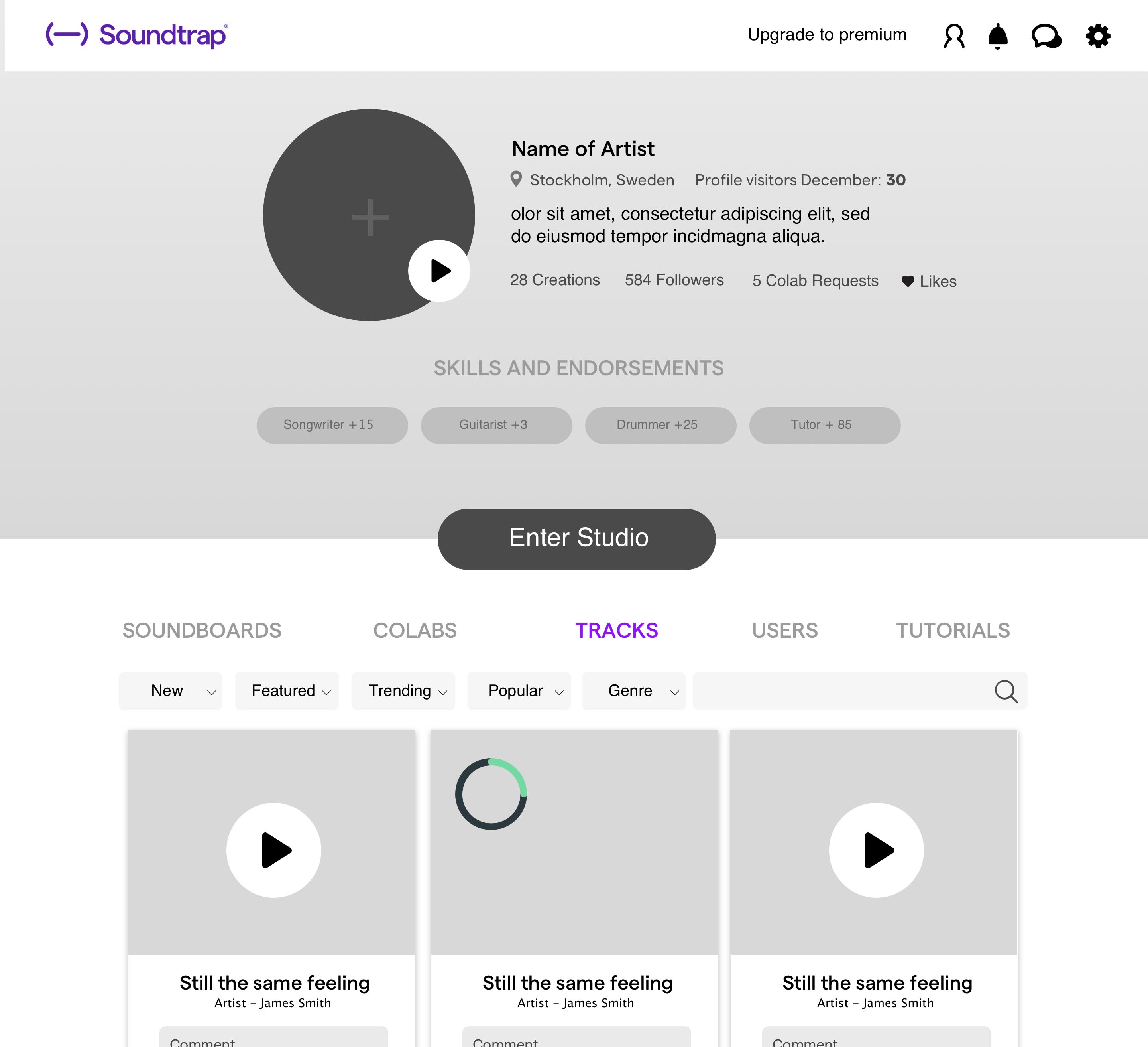
Wireframing - Based on the answers we got from our surveys and first interviews we started to create low-fi wireframes that reflected the pains and gains we got from our users. We wanted to highlight the CTA-button, so you could enter the studio easily and the menu was supposed to feel intuitive and easily navigated. Also, a first draft how the Pinterest-inspired Soundboards could look like.
Qualitative interviews - We held 3 qualitative interviews with Soundtrap users, 1 hour long per person, where we really went into depth about what they wanted, We tested our first hypothesis and wireframes and got really valuable feedback. We asked for an example of where they get their inspiration from and where they store it, if they store it somewhere and if they have a commonplace to save their quick recordings, notes, etc. The answers we got didn't confirm our first hypothesis, so we had to iterate and revise the hypothesis.
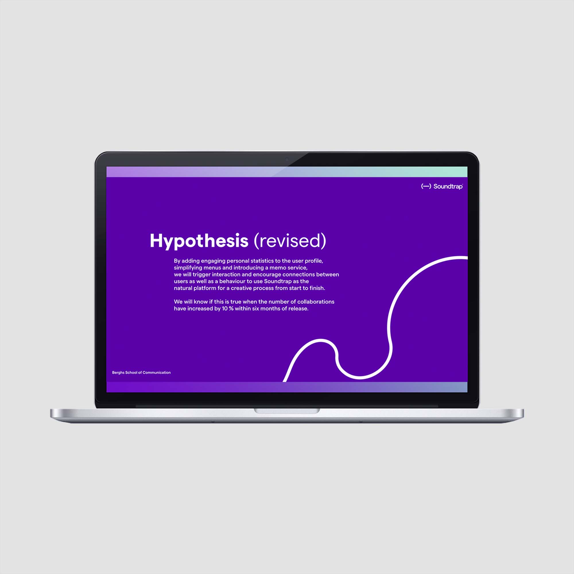
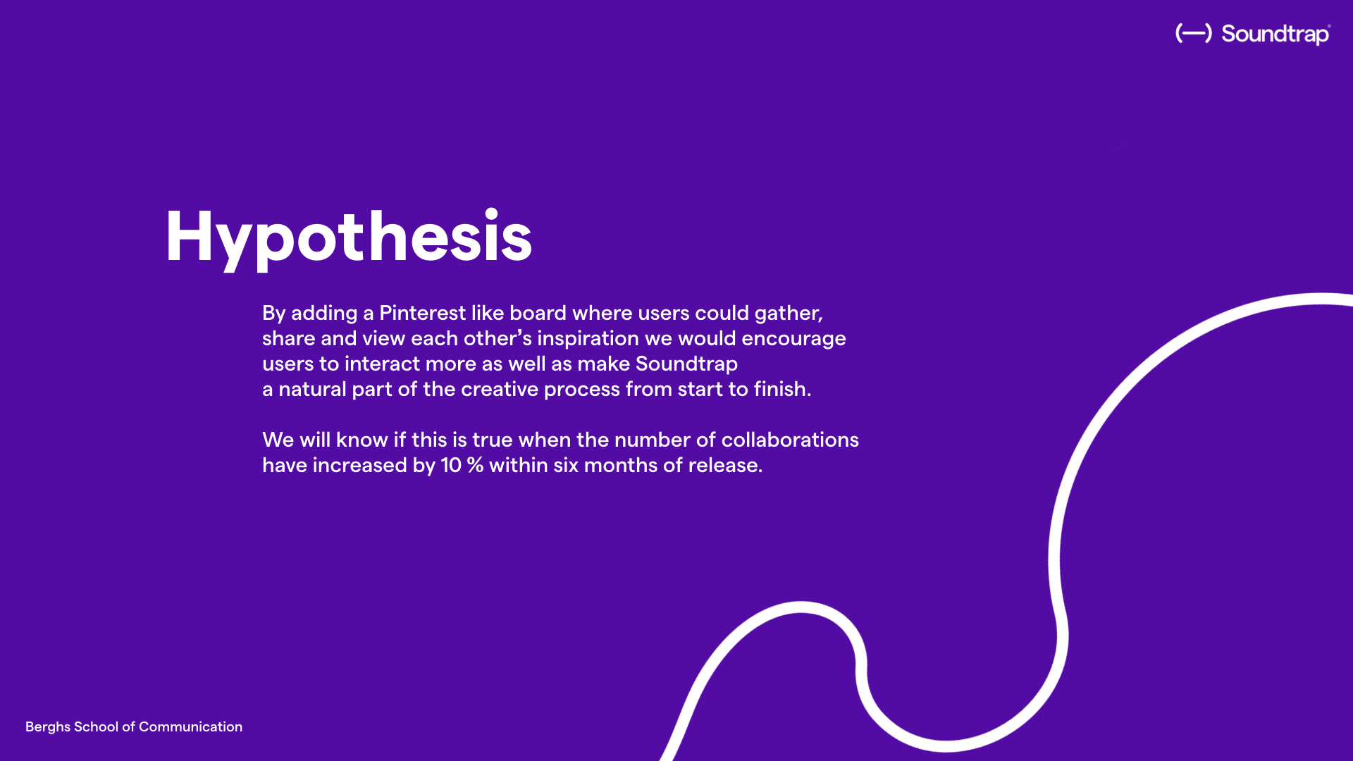
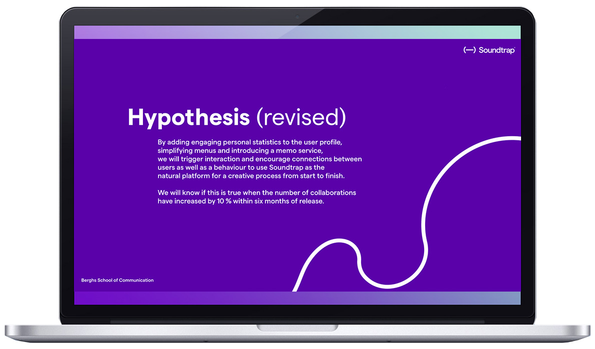
Hypothesis (revised) - As we felt that our findings from our research and tests showed such a clear change from our initial hypothesis, we made a revised edition of the hypothesis based on the data that we’ve gathered.
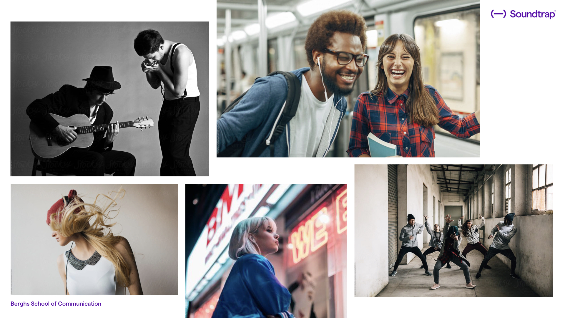
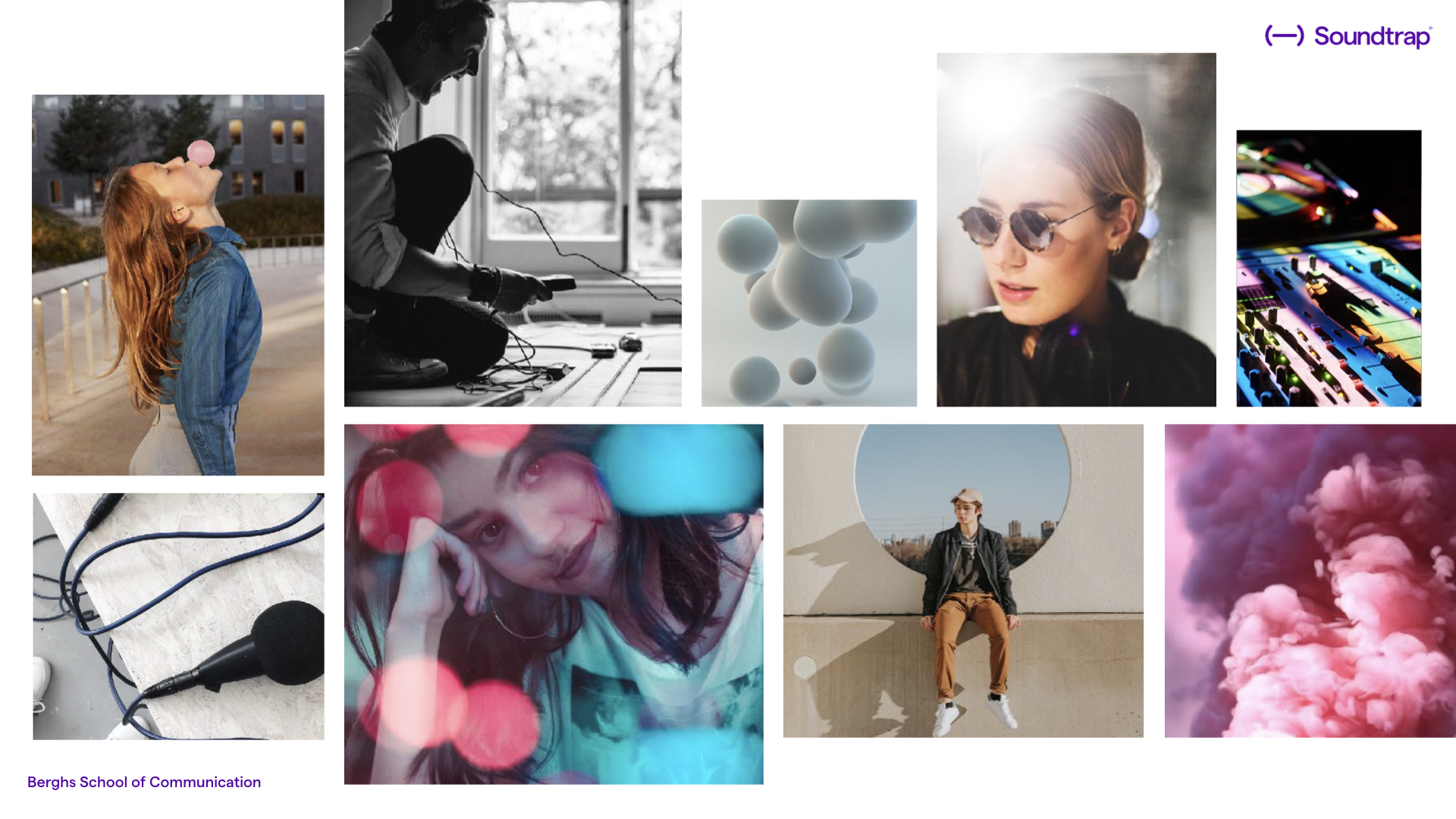
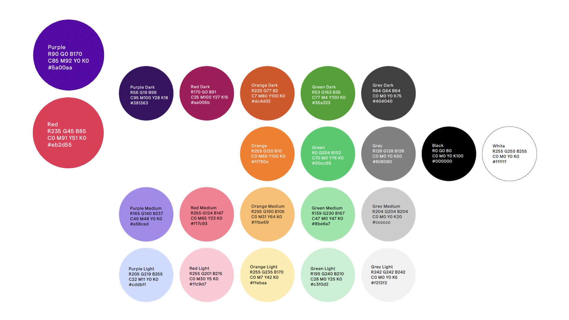
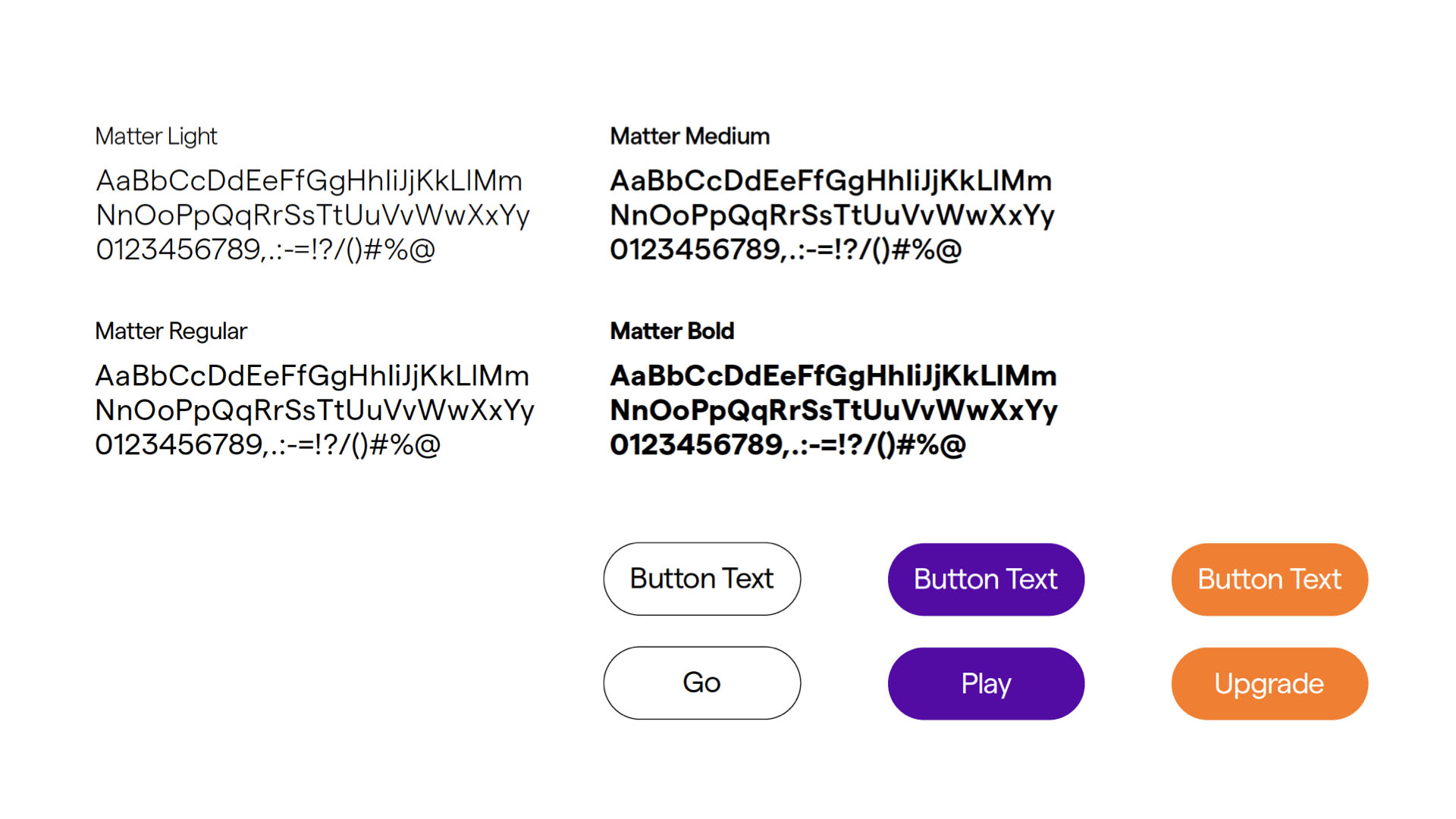
Look-n-feel - As Soundtrap already has a very clear stylistic guidelines set out ( Created by Stockholm design lab), we’ve simply followed their lead and applied their look n feel to our interface. Also in order for it to be a realistic project that could be incorporated into the existing site and service. This is what parts of their styleguide looks and feels like. It’s youthful, free spirited and the imagery are never or should at least not feel staged.
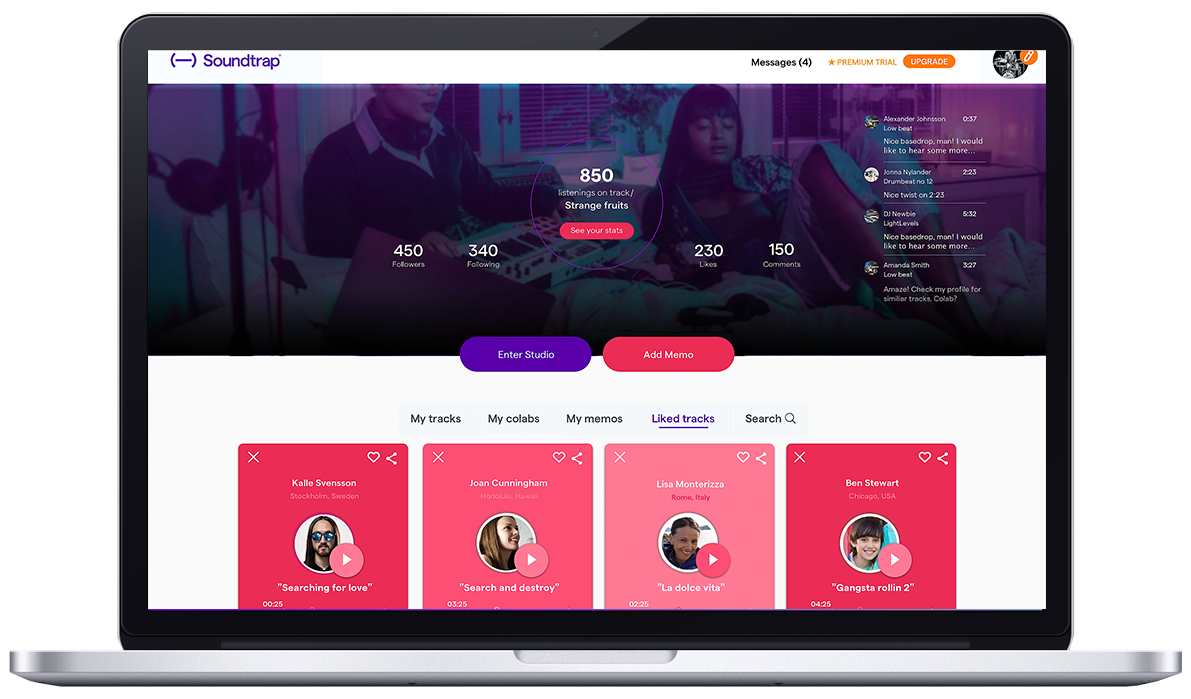
Prototype - All the feautures are visual outputs of the data we collected from the users, in line with the brand identity of course.
- Quickly access your own tracks and memos.
- One click action to record with a clear overview with all your notes in one place.
- Easily share and the sound memos can be opened in the Studio.
- Interaction info (comments, messages, colabs etc) have been clearly placed in the dashboard above with moving indicators to build curiosity and motivate to engaging with others.
- Added memo function and given it the same CTA status as the Studio.
- Being able to easily see your comments are important, anything that builds up a vivid image of a person creates value.
Please have a look at https://bit.ly/2BVAI0a for a clickable prototype of the final result.
Discussion - ( Backlog ) We came across ideas and suggestions along the way that we didn’t have time to design or that we didn't find relevant for our MVP.
Ideas for how to change the interface in the app in “invite a user” view (include more information about the user, and maybe give the option to view profile rather than invite in “blindness”, very few people take the leap) In the mobile view we won’t just stack per se, but think of use on the go and the site with break into “mobile mode” where the “add memo” button will take priority over “enter studio” button, as users generally don’t use the studio on the go, but they do collect info and inspiration.
The possibility to jack in a “sell users’ tracks” services where Soundtrap work as the intermediary handling licenses etc taking a percentage
Aspviksnäs
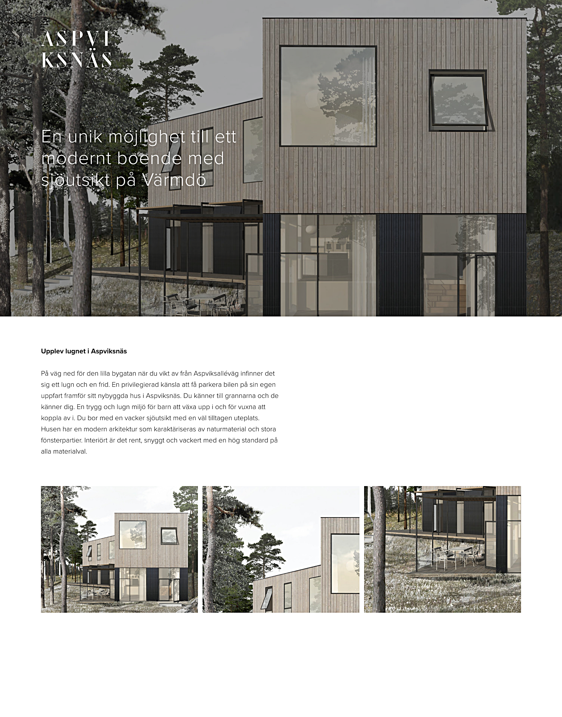
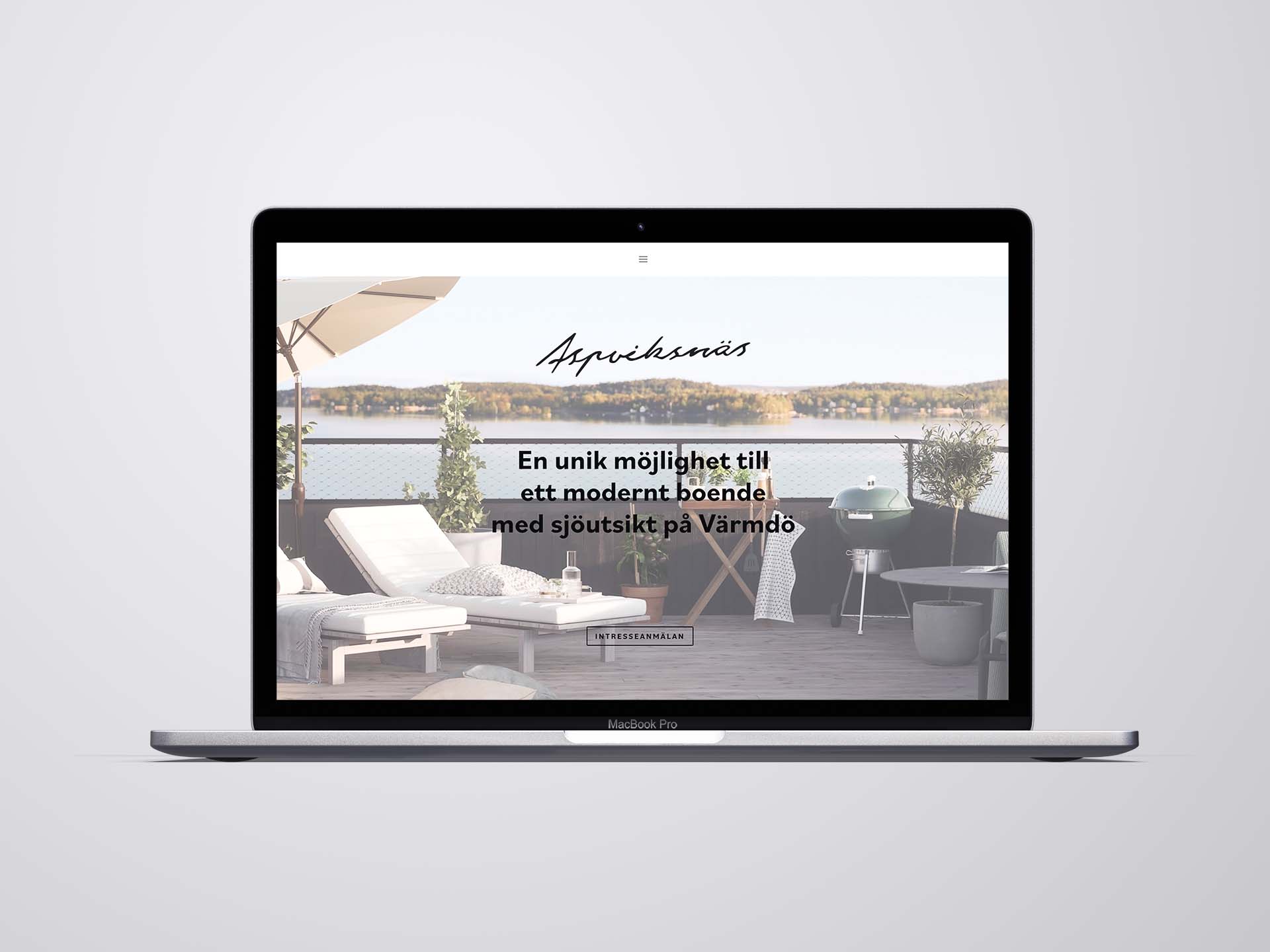
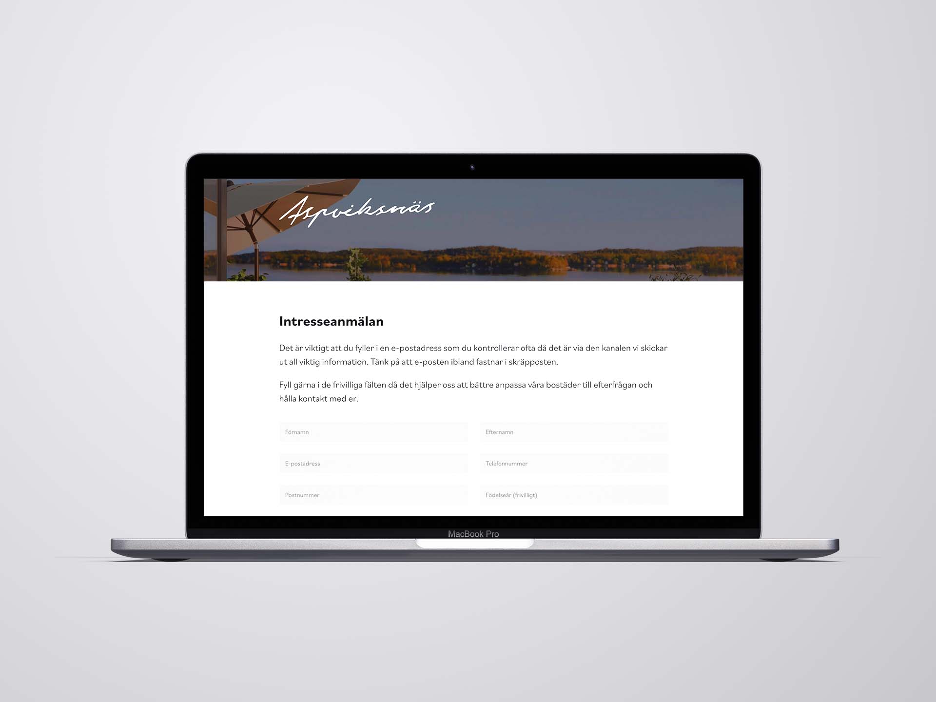
Assignment - Branding / graphic design / web design / dev ( visual builder ). The brief was to create a concept for the product, create a landing page for possible stakeholders who wanted to buy a new build apartment in Aspviksnäs. Make the site intriguing and supply all the users with sufficient information to make a purchase.
Client - Gremio Invest
Logotype - 3 different proposals as shown below were presented for the client. Below option was choosen.
Graphic guidelines - Graphic guidelines were created based on the logotype chosen. Something that reflected the area where the houses were going to be built and something that captured the overall mood and feel.

Web Dev. - All the design elements and the strategy behind it were designed and developed into a responsive landing page for the possible stakeholders.
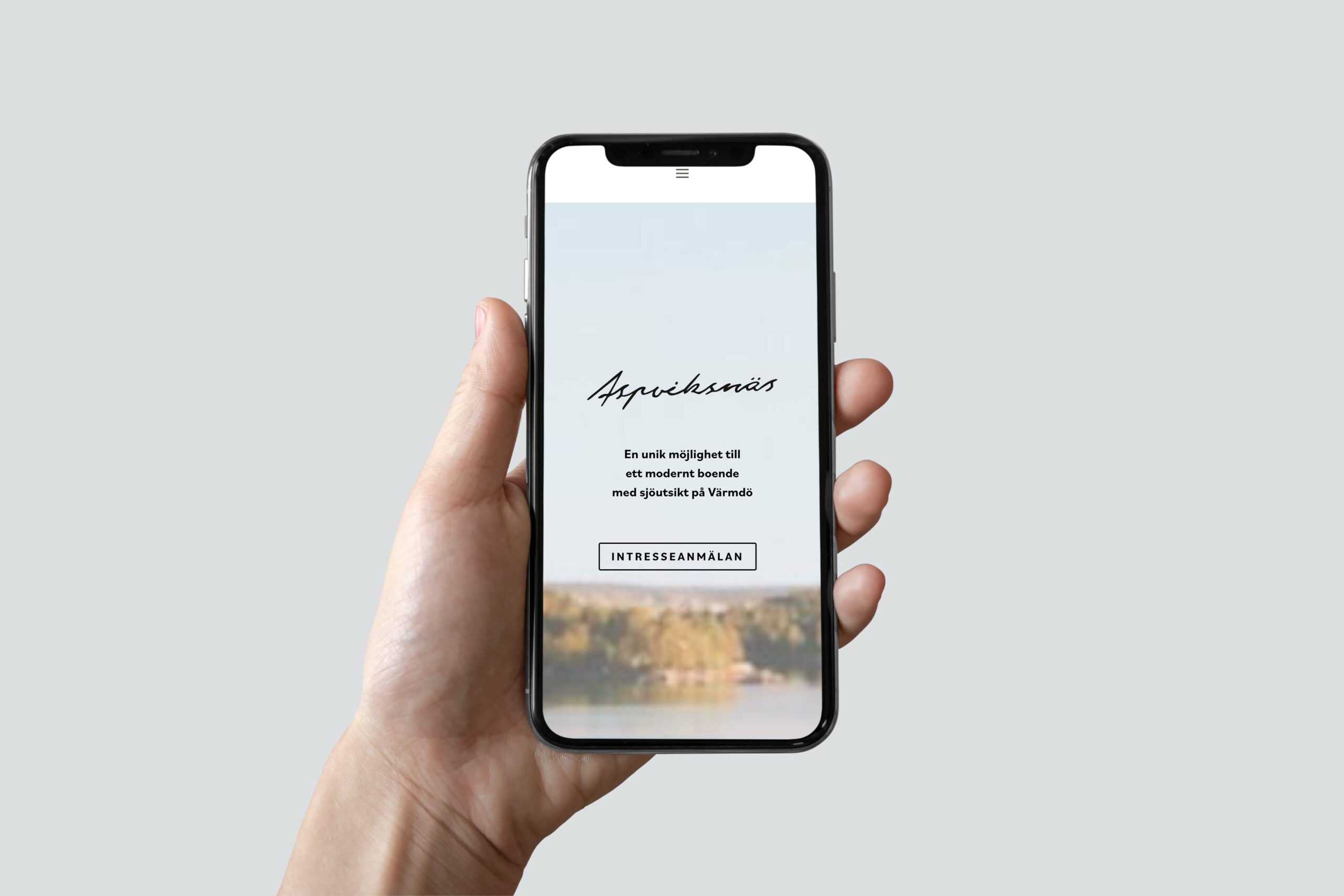
Insights - Learned a lot from working with this project. A lot of internal stakeholders and fast decisions had to be made along the way. A lot of testing and mail hosting to make the contact as smooth as possible for the end consumers.
Selected Works

